Winter cream line
for adults & KIDS
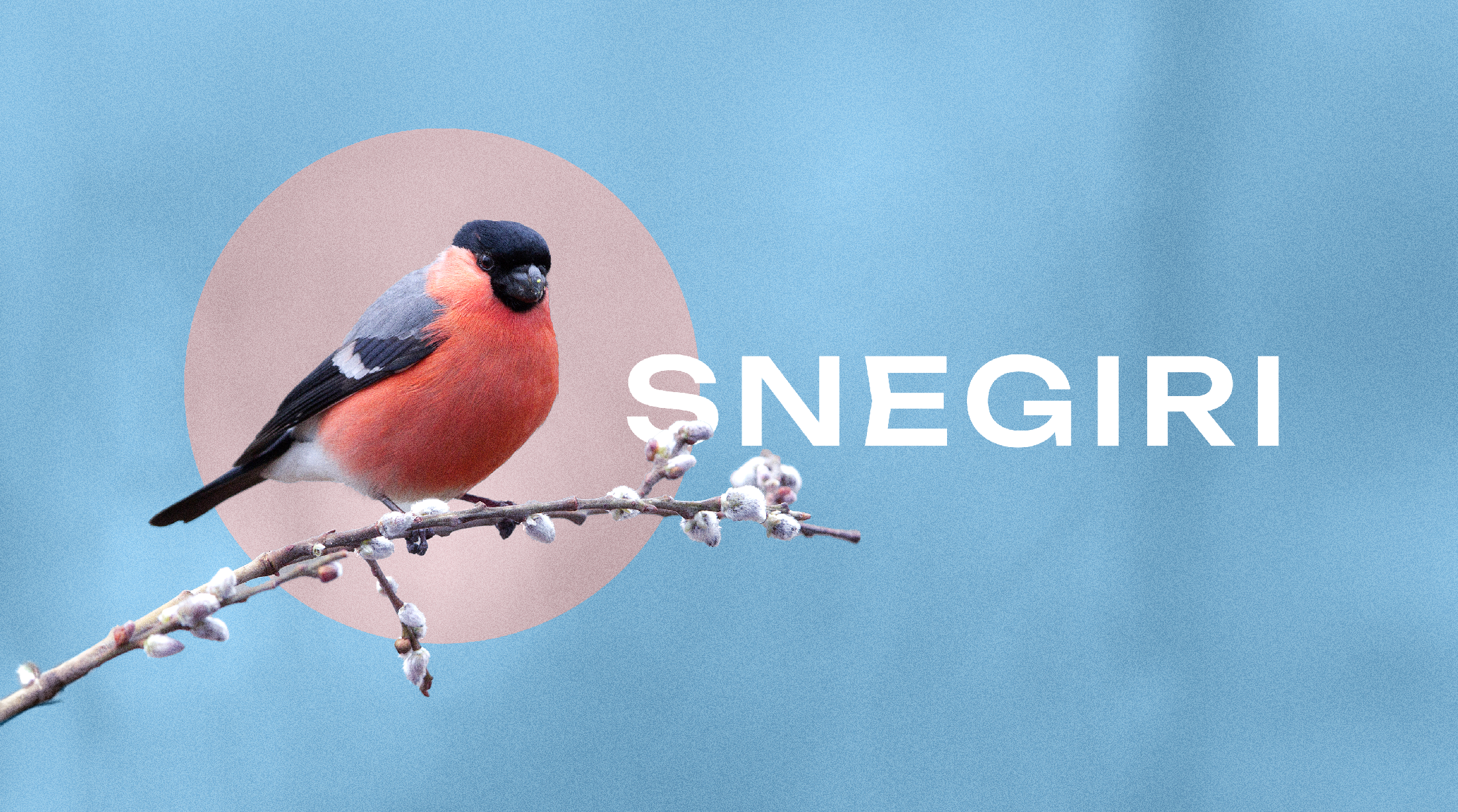
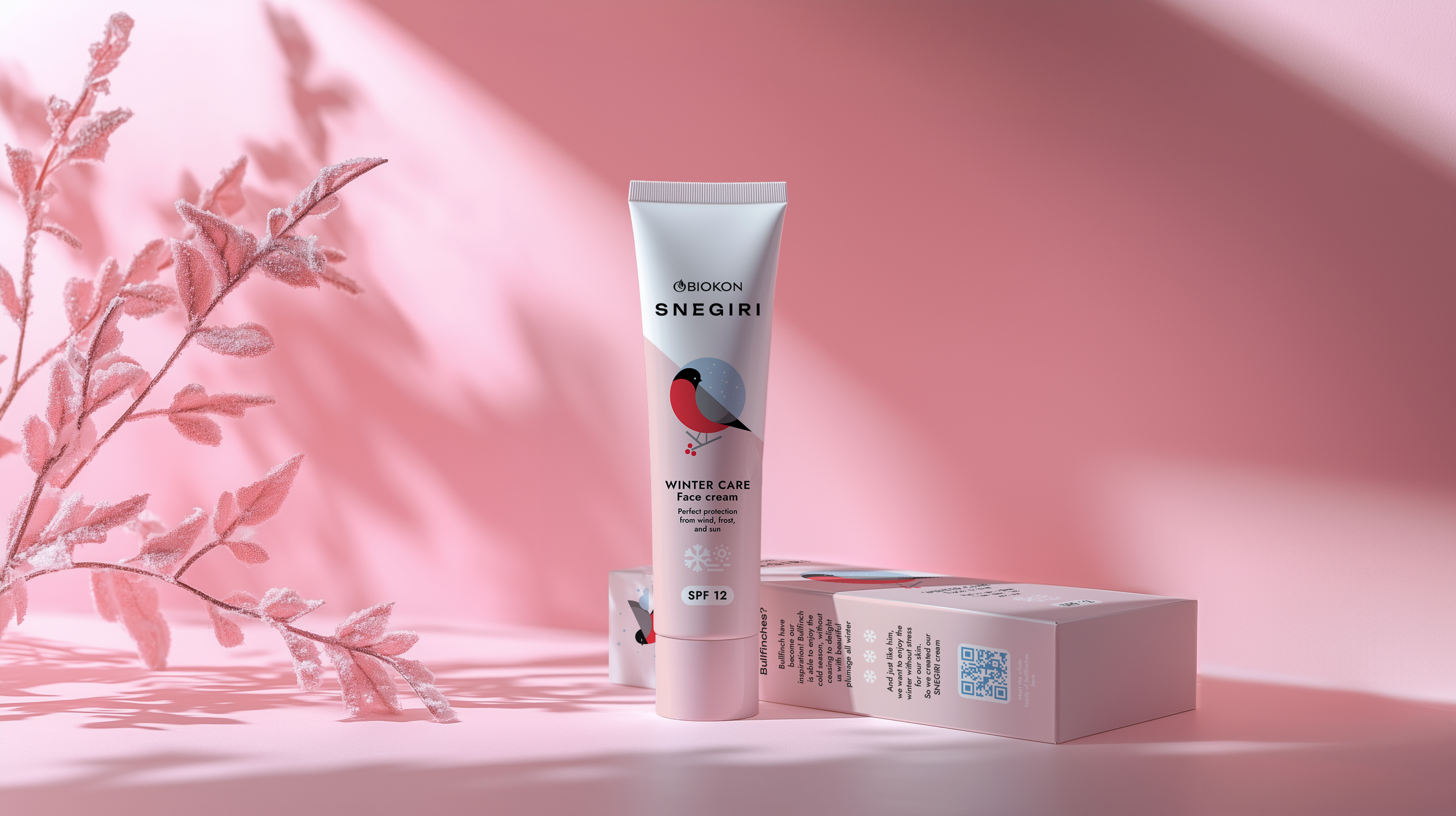
SNEGIRI cream is designed to protect delicate skin from cold and frost. My task was to create a design that is clear-cut yet eye-catching for a series of protective winter creams. Created specifically for the Russian market, the name 'SNEGIRI' on the packaging translates to "Bullfinches" in Russian. The bullfinch, a charming and familiar symbol of the winter season, was chosen as the central visual motif. The packaging's dynamic two-tone split serves as a visual attraction, setting the product apart from competitors on the shelves.
2023
#Packaging #Illustration
For the SNEGIRI hand cream, a soothing light blue was chosen to differentiate it within the product line while maintaining a cohesive brand identity. The color creates a sense of calm and protection, ideal for a product designed to shield hands from winter’s harsh elements. The bullfinch motif, paired with the serene blue background, reinforces the theme of warmth and care, making the hand cream both visually appealing and instantly recognizable
on the shelf.
The SNEGIRI children's cream features an adorable, hand-drawn bullfinch, redesigned in a playful style to capture the attention of both parents and kids. The packaging uses vivid color combinations and a fun, approachable font to create a lively and engaging look. This design not only makes the product stand out on the shelf but also connects with children, making skincare feel friendly and fun.


